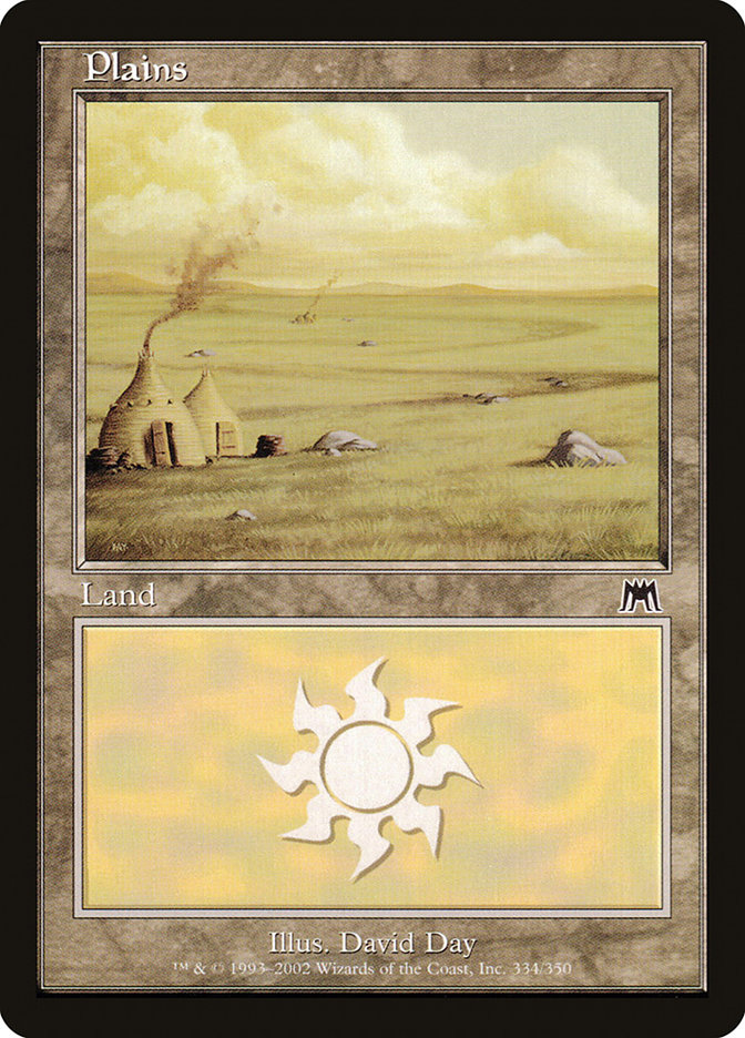
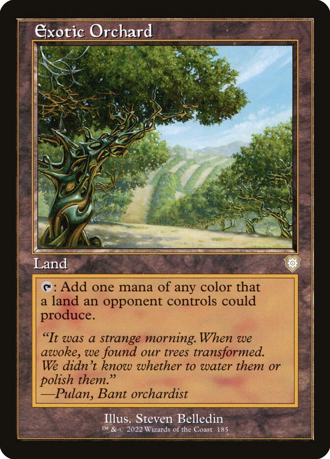
The new ones are more accurate to how the physical cards look
If you look, they do have coloured borders around the text box and certainly not the heavy black lines your other versions have. Regardless of which looks better, the new ones are more correct.
I could take the basics either way (I do prefer the darker frames), but the brighter gold border around the Exotic Orchard in the client compared to the paper printing is noticeably brighter and is what caused me to notice this to begin with.