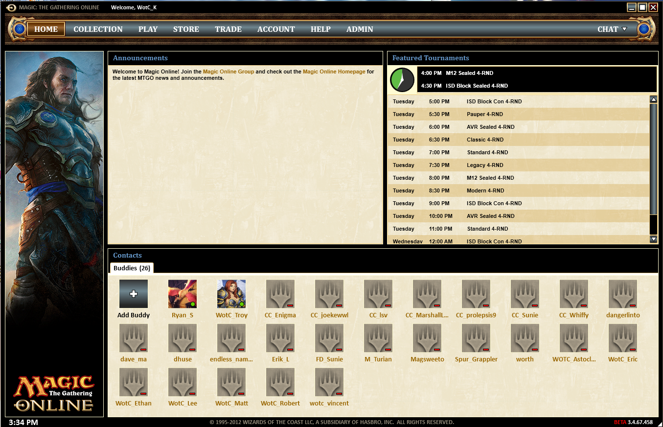
The way premier events are displayed on MTGOs main page when you log in is extremely inconvenient. I literally use https://mtgoupdate.com/ to know when preliminaries and other scheduled events happen. My suggestions are to:
- display events in the order they happen in - with the closest events on top of the list, instead of sorting them by event type first
- display not only the amount of time left until the event but also its starting date and time. It is really inconvenient to have to do the math every time you see an event starting in two days 21 hours and 46 minutes.
- give some visual cues that indicate the format of the event. Coloring every format differently would make it much easier to know if there are any events that interest you at a glance. Formats already have colors associated with them in the "CONSTRUCTED" tab in the client, so you could just use those.
-the premier event boxes listed on the main page currently look very nice, but there are tons of events and only a few of those boxes fit onto the screen at a time. That makes it inconvenient to scroll through them. They could be smaller for clarity.
In general, the previous version of Magic Online's visual design and user interface did a lot of things right, from the user's perspective.
Please take my feedback into consideration. I'm a serious streamer.")
- display events in the order they happen in - with the closest events on top of the list, instead of sorting them by event type first
- display not only the amount of time left until the event but also its starting date and time. It is really inconvenient to have to do the math every time you see an event starting in two days 21 hours and 46 minutes.
- give some visual cues that indicate the format of the event. Coloring every format differently would make it much easier to know if there are any events that interest you at a glance. Formats already have colors associated with them in the "CONSTRUCTED" tab in the client, so you could just use those.
-the premier event boxes listed on the main page currently look very nice, but there are tons of events and only a few of those boxes fit onto the screen at a time. That makes it inconvenient to scroll through them. They could be smaller for clarity.
In general, the previous version of Magic Online's visual design and user interface did a lot of things right, from the user's perspective.
Please take my feedback into consideration. I'm a serious streamer.